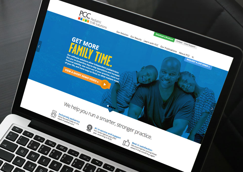
PCC has just unveiled its redesigned website, a successful collaborative project with Stride and an independent web developer — and we’re thrilled with the results.
This website, www.pcc.com, is an excellent example of a website overhaul in which ineffective elements were identified and replaced with robust, carefully-considered solutions that bring the site to a whole new level.
When we were approached to work on this site revision, PCC was ready to move away from a soft-sell approach to one that’s bolder and more straightforward. We dove in with a new messaging strategy focused on simple key benefits and statistical proof delivered with powerful attitude.
Design played a key role in communicating this new attitude. Clean, sharp layouts and bold use of color bring new life to the website without losing critical brand recognition, while the use of video, animation, and infographics deliver high-level impact.
We also explored ways to make the website work harder, primarily to bring more visitors into the sales funnel. We developed a variety of calls to action placed prominently throughout the site, providing multiple ways for visitors to explore the company’s offerings and connect with PCC.
Because PCC scores so well in national rankings among healthcare software vendors, we felt this was a critical takeaway message from a visit to the site. As PCC was open to more direct language about the competition, we developed content that demonstrates PCC’s clear advantage over its toughest competitors.
Check out the site here: www.pcc.com
