I recently happened upon a photo of myself from 15 years ago. It caused me to reflect on how many times clothing styles have changed in just my lifetime. How could I have thought that outfit was remotely stylish? Good Lord.
It’s the same in graphic design. Tastes change, and design changes with them.
To stay appealing to their customers, brands need to reflect the times. Consumers prefer to align themselves with brands that reflect well on themselves, so companies must appeal to this desire. It doesn’t matter how innovative a company is on the inside; if it doesn’t demonstrate a modern attitude on the outside, audiences may assume that the company is not in tune with their needs. What’s worse, it may be seen as falling behind in the marketplace.
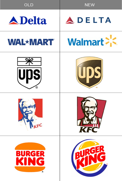
But how do you stay fresh and modern without compromising your well-earned brand recognition? Often, the answer is not a complete rebranding. Many logos and brand systems can effectively be revitalized by reworking a few components — making graphic alterations, font changes, and color shifts while leaving the basic structure intact. We call this process a “freshening”. It’s a solution that retains the brand’s essence, but gives it a whole new lease on life.
As long as your brand has a good foundation, a freshening makes sense from a budgetary standpoint — it’s less expensive in design time and also easier on your cash flow. Updates to your various marketing vehicles can be applied over time, rather than all at once, since a refreshed logo doesn’t create as much confusion or require as much explanation as a complete overhaul.
Check out these examples of well-known logos that have undergone a freshening in recent years. While not all of these new versions are universally admired, it’s safe to say that these brands have successfully demonstrated that they’re focused on staying fresh and relevant to their customers. Like shedding an outdated suit and buying a new one, they’re reflecting the times. Are you?
