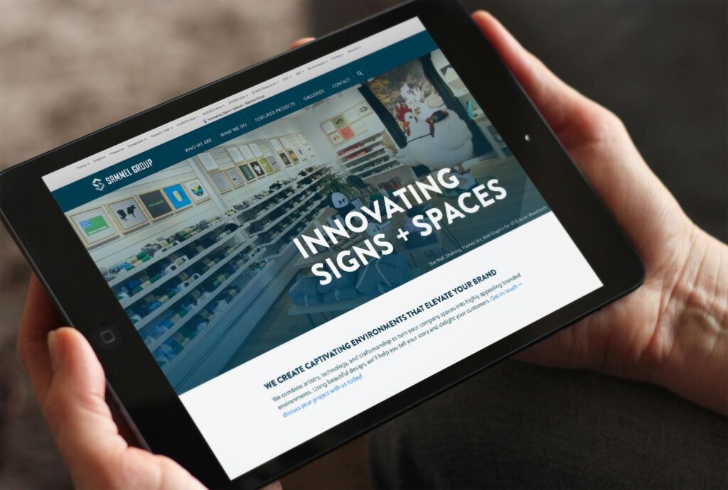
After almost two decades in the signmaking business, Sammel Signs had evolved to provide much more than signs — it had become equally skilled at creating beautifully customized, branded spaces. A name change and rebrand was needed to reflect this evolution.
Stride was called upon for naming, tagline development, logo design, and website development, and we were honored to collaborate with this local industry leader.
We first developed a new name and tagline, then embarked on the logo design. The chosen logo integrates bold, modern typography with an “S” icon to symbolize the formation of a new space within 4 walls, as well as the inter-connected nature of deliverables they create.
The new website highlights the company’s shift from a sign-focused company to one with more robust capabilities. Featured project pages highlight their interior branding work for businesses in a wide range of industries — from Northfield Savings Bank to Cabot Creamery. Our coding work for the photo gallery allows Sammel to update it quickly and easily, as well as create custom galleries that reflect unique materials or specifications.
Check out their new website here: sammelgroup.com

