So, you’re itching to give your website a refresh, eh? It’s almost spring, and as we emerge from our winter hibernation, many organizations are looking to spruce up their marketing efforts–especially when it comes to their websites.
A refreshed website can help attract new visitors and make your current customers give you a second look, but it’s not always feasible or within the budget to overhaul an entire website and start from scratch. We recently worked with two clients – Gifford Health Care and Vermont Day School – both of whom didn’t have the need for an entire website redesign, but had great success with a simple yet seamless homepage refresh.
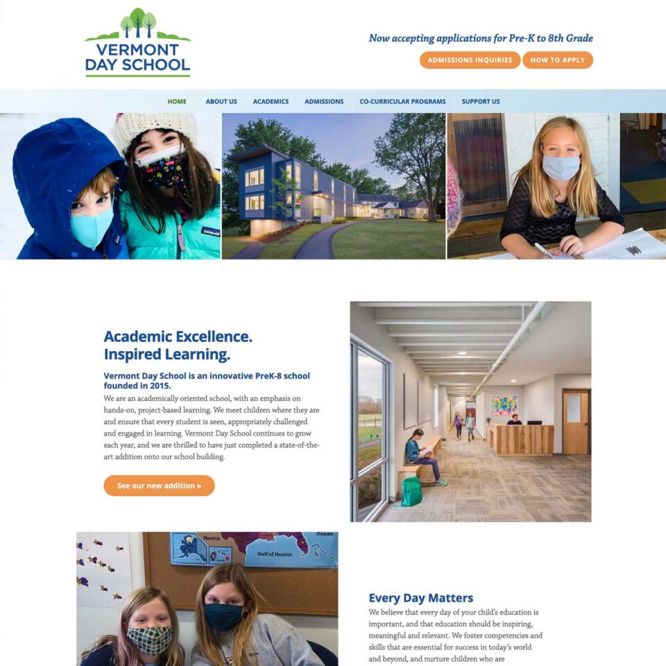
Vermont Day School homepage refresh
With a beautiful logo, strong brand presence, and a current website they find is easy to navigate and update themselves, our client Vermont Day School was looking to make their years-old website look new and modern while maintaining the user-friendly aspects they like. After recently undergoing major renovations and a building addition, they wanted their website to reflect the same clean, modern look of their physical space.
Using updated photos of smiling, happy kids and new copy provided by the client, we set to work creating an image carousel that stretches screen length. We also created new places to make announcements both at the top and bottom of the homepage, and also made more room for some of Vermont Day School’s beautiful videos so they could stand out. All of these changes blend seamlessly with the branding, color palette, and general layout of the rest of the Vermont Day School’s beloved website.

Before 
After
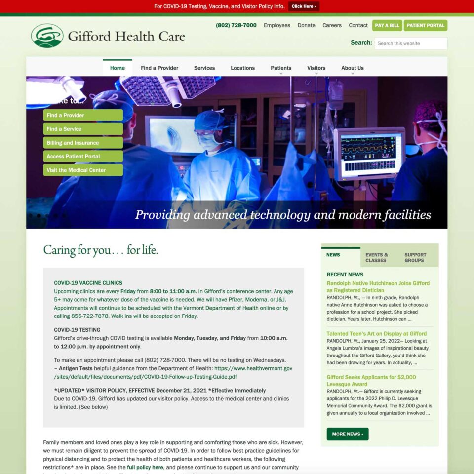
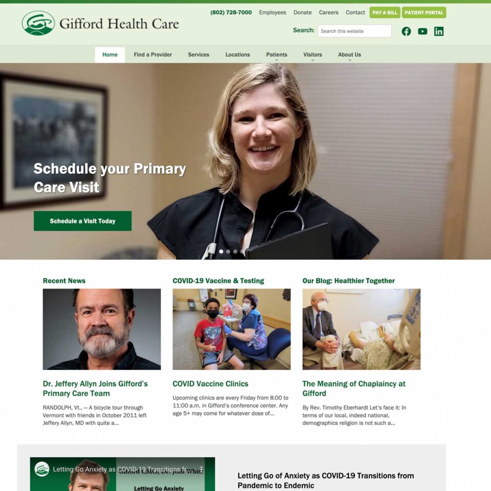
Gifford Health Care website homepage refresh
With the challenges of the COVID-19 pandemic in the ever-changing world of health care, Gifford needed help getting urgent messages out in a more efficient way. Their current homepage design posed a challenge for switching out timely messages, and important notices were not as prominent as they could be.
Not only did we use the WordPress block editor to bring full-width modernity to the home page, header, and footers, we used it to replace static text blocks in a sidebar with blog categories that automatically update when new blog posts are added to the site. This functionality makes it easy to refresh content while also providing aesthetic improvements.

Before 
After
A limited refreshing of an existing website that still has relevant functionality can be easy, cost efficient, and add a much-needed glow-up to any website. Contact us today to chat about how we can do a spring refresh for you!
