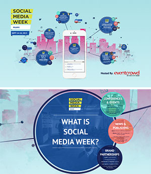
Prezi may be a good alternative to Powerpoint when creating your next presentation.

Prezi includes dynamic functions, allowing for more creativity and depth when designing a presentation. Unlike the linear slide format of Powerpoint, Prezi begins with a large canvas and allows the user to easily add text, vertical or horizontal images, video, and audio to slides anywhere in that space. The user can jump around the canvas to different slides during the presentation, which is great for making changes to the flow of slides on the fly. The unique Prezi functions are fun to use, however it’s easy to overdue it with the “bells and whistles” when starting off. Make sure you’re using the additional features in a relevant way that will enhance your presentation, not hinder it.
For instance, the “zoom” feature is a great tool for targeting detailed information within your presentation. You can start with a large canvas, zoom into your first main slide, then zoom again or pan around that slide to show a detailed area within it. It’s a different way to engage the viewer, and to break up content when moving through multiple slides. But again, if used too much, this function can be more distracting than engaging. Too much animation and zooming can even cause viewers to get headaches or become dizzy, so it’s best to use this sparingly.
Note that Prezi is a web-based program. Your Prezi can easily be embedded in blogs and web pages, or can be loaded on various devices without having to download a program onto your computer. There are templates available with the program that include specific fonts, graphics, and color schemes to start with, just like Powerpoint. You can also customize your presentation if you want to use advanced features. The basic version is free, but if you get into theme customization and offline versions, there are different program fees depending on your needs.
Prezi is great for breaking out of the linear mold. It’s a new take on developing traditional slide presentations like Powerpoint, and a fresh way to keep viewers engaged. It’s also great for those who want to learn a new tool. But just remember, people come to a presentation for interesting information, not just the flashy graphics.
Find out more at prezi.com.
