Logo/Identity
An inspiring logo for a floral company
GMFSI’s logo blossoms in more than one way. With its flower emerging from green mountains, this design reflects the brand’s growth and modern sensibilities. As a refresh on an established company’s brand, the mountains are a nod to the company’s Vermont roots, while the brightly blooming flower catches the eye.
↩
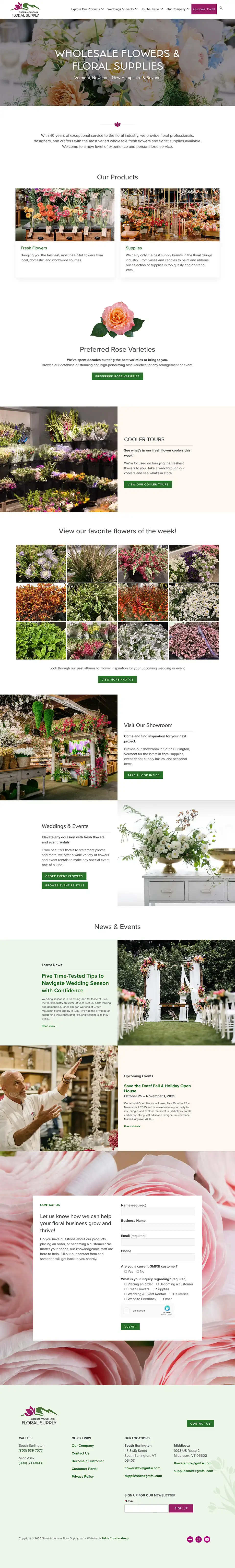
Web design
A website blooming with possibilities
We wrote, designed, and built this brand-new website that bursts with ideas and inspiration. As a wholesale supplier, GMFSI wanted to reflect its market position as an industry expert while enabling customers to make easy purchase decisions. A new site layout, robust product sections, a sortable database, and a new customer portal elevate the customer experience while saving GMFSI staff precious time and energy.
Signage
Putting petal to the metal on delivery vans
GMFSI delivers to four different states in the Northeast, and their delivery vans needed a facelift that aligns with their new brand. Just like a gorgeous floral arrangement, these show-stopping van wraps utilize the brand’s bright new colors to turn heads wherever they go.
Print design
Driving sales through catalog design
Our work on the GMFSI brand extends to their annual Event Rental Catalog. We set the design tone for this important sales collateral piece that showcases all of their event rental offerings — a way that wedding and events professionals can find everything they need all in one place.
↩
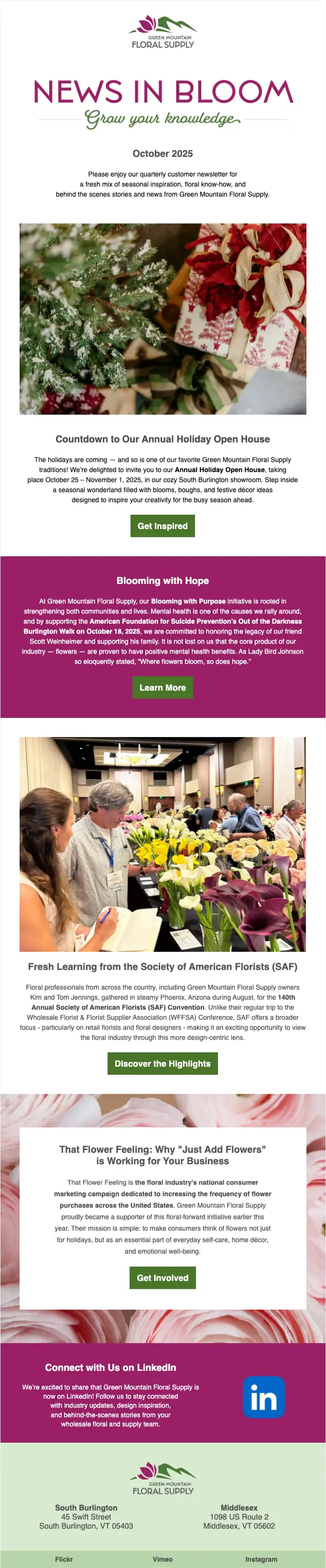
Email marketing
Helping clients grow their knowledge
As part of their new brand, we designed this quarterly customer newsletter template to help our client deliver fresh news to floral industry professionals. This attractive template allows the client to easily plug in fresh content for a simple, beautifully designed newsletter every time.
Signage
Exterior signage with sophistication
There’s nothing like gorgeous outdoor signage to set the right tone for welcoming visitors. We helped Green Mountain with the right solution for a sophisticated look, with a soft silver metallic substrate that contrasts perfectly with the dark gray tones of their building.