Refreshing the brand
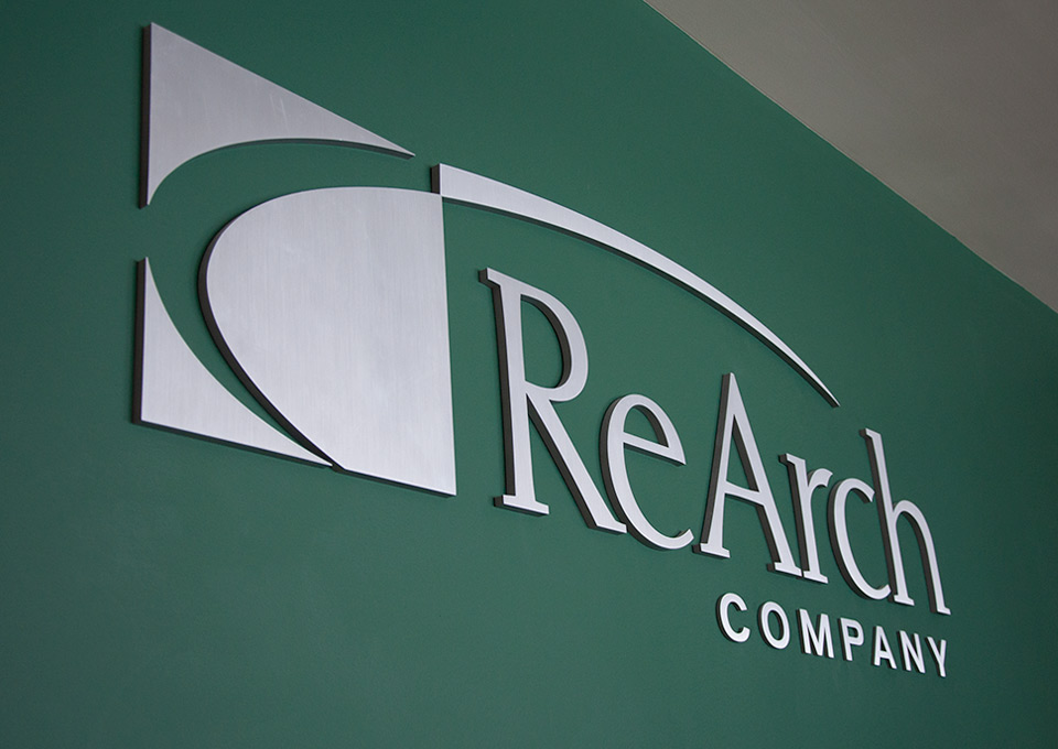
With well-established brand recognition, ReArch was hoping to infuse their brand with a more professional feel, and to compete with the larger construction companies in the area. We started with a refresh of their logo typography and icon to give it a more modern and polished feel. The new logo has been used in a wide variety of applications — large scale signage, vehicle graphics, online, print advertising, and more.
