Logo/Identity
A logo refresh that covers new terrain
Holt Gilmour didn’t want to stray too far from the Vermont terrain iconography in their original logo, but they wanted a more modern look. We refreshed the logo with rounded edges, new fonts, and a refreshing green color palette that grabs attention and reflects the primary focus of the business.
↩
Web design
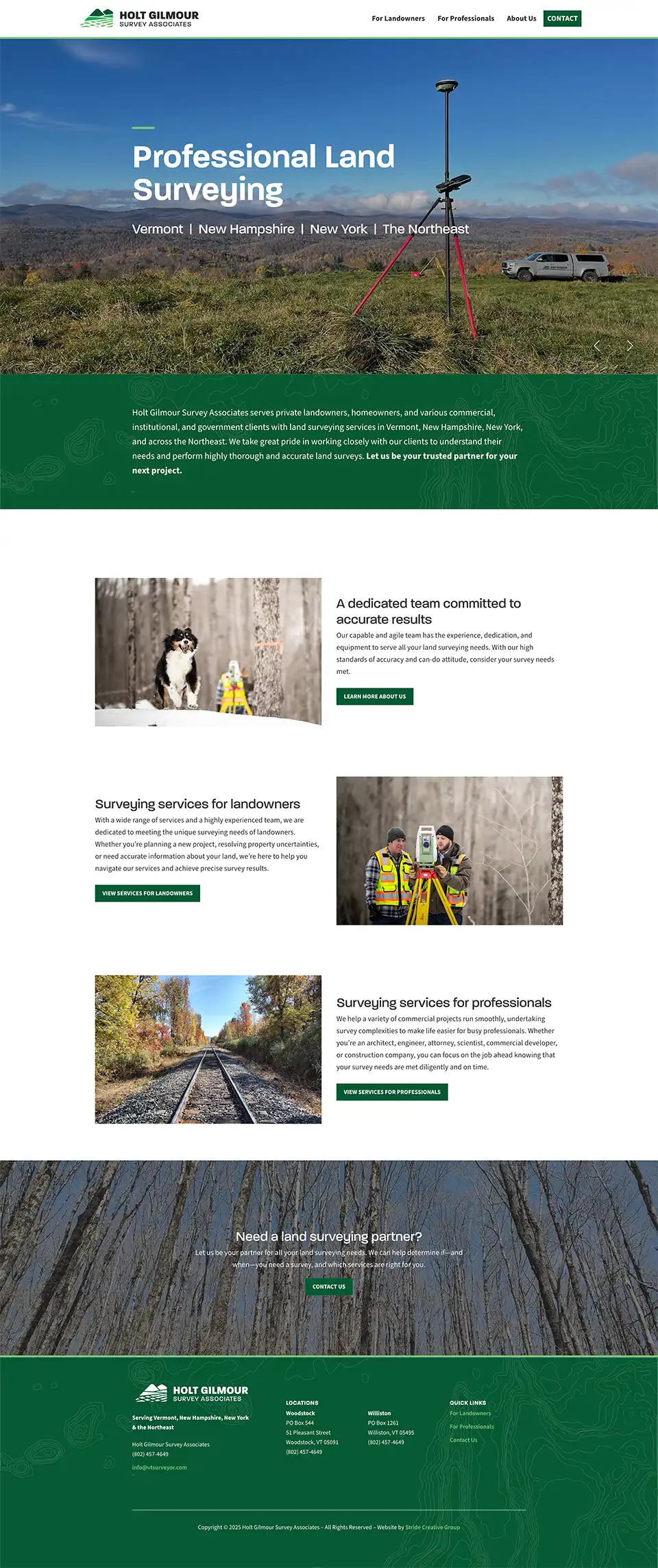
A website that pushes boundaries
For this website, we reflected the company’s offerings with site architecture that easily delineates services sought by homeowners from those sought by professional developers and contractors. For a company that offers numerous services, clarity and information was a top priority. We kept the look of the site simple and modern, and built it to perform well on search engines.
Getting noticed on Google
To boost online visibility, we launched a Google Ads campaign focused on driving more qualified traffic to the Holt Gilmour website. With a smart strategy and optimized settings in place, our team monitors the campaign regularly. Periodic tweaks and monthly reporting help ensure that the campaign runs smoothly and successfully.
Signage
Hitting the road with the brand
For a service business that covers a lot of miles, vehicle graphics are a great way to get the word out. We settled on a simple solution with a large logo that spans both doors for maximum visibility. It’s a solution that helps build brand awareness across the state 24/7.